Batman:
black and white - An innocent guy
 |
| No normal guy looks this scary. |
I really disliked this comic book. First, the main
character is extremely irritating. He thinks he needs to do something horrible
in order to prove that being good feels better. He decides to kill Batman and
then compare that feeling to being nice. This is ridiculous. No ‘innocent guy’
would ever consider cold-blooded murder. Killing Batman would mean increased crime in Gotham because innocent people will have no protection. He talks about murder like there is nothing wrong with it. He just wants to try it out and can go back to being good afterwards. That isn't how it works though. I think that if you have killed someone you are stuck being evil, particularly isfthe victim is innocent. This guy is wrong and evil but won't accept that, and that irritates me. Even if the character did have a point about trying out good and bad (which he doesn't) he should do something smaller
that does not involve the murder of a celebrated hero and innocent
people killed by unrestricted super villains. With a crime
like stealing or kidnapping someone (then releasing them after) he would still
get the feeling of badness. His stupidity irritates me. Another reason I don’t
enjoy this comic book is the art style. I may be biased due to my familiarity
with beautiful, elegant manga drawings, but everyone in this comic appears old,
ugly, and exaggerated. The main character looks really creepy, which does not
at all fit with his title of ‘an innocent guy’. Everyone also has exaggerated
facial expressions that make them look both ridiculous and terrifying. Even
Batman, who should be a strong, admirable hero, looks disgusting and wrinkly.
The ugly art style is too distracting to even allow me to focus on the plot.
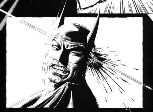 |
| Batman's chin is weird and he looks about 60 years old. |
Finally, the panels are way too crowded. It is too
difficult to focus on what is going on. This can be seen in the panels below:
The two bottom shots are absolutely chaotic. One includes Batman,
multiple computers, a dinosaur, a giant coin, the Bat-mobile, and a bunch of
bats, all stuck inside a cave. The picture ends up looking like a large black
mass instead of something cool. If this was in colour it would be even more
distracting and crowded. I find that this confusing layout takes away from the
story because I’m overwhelmed by so much happening in such a small area. To
summarize, I can’t stand to read “An Innocent Guy” due to the idiotic
protagonist, ugly art style and crowded format.

No comments:
Post a Comment